
Choosing the right paint color can significantly influence the mood of a bedroom, turning it from merely functional into a sanctuary that encourages rest and relaxation. Soft neutrals and muted tones offer a serene backdrop that eases the eyes and calms the mind.
Soft whites and warm neutrals are timeless choices that enhance a sense of spaciousness and tranquility. When paired with warm undertones, these shades become cozy without feeling sterile. They also serve as versatile canvases for adding textures or accent colors.
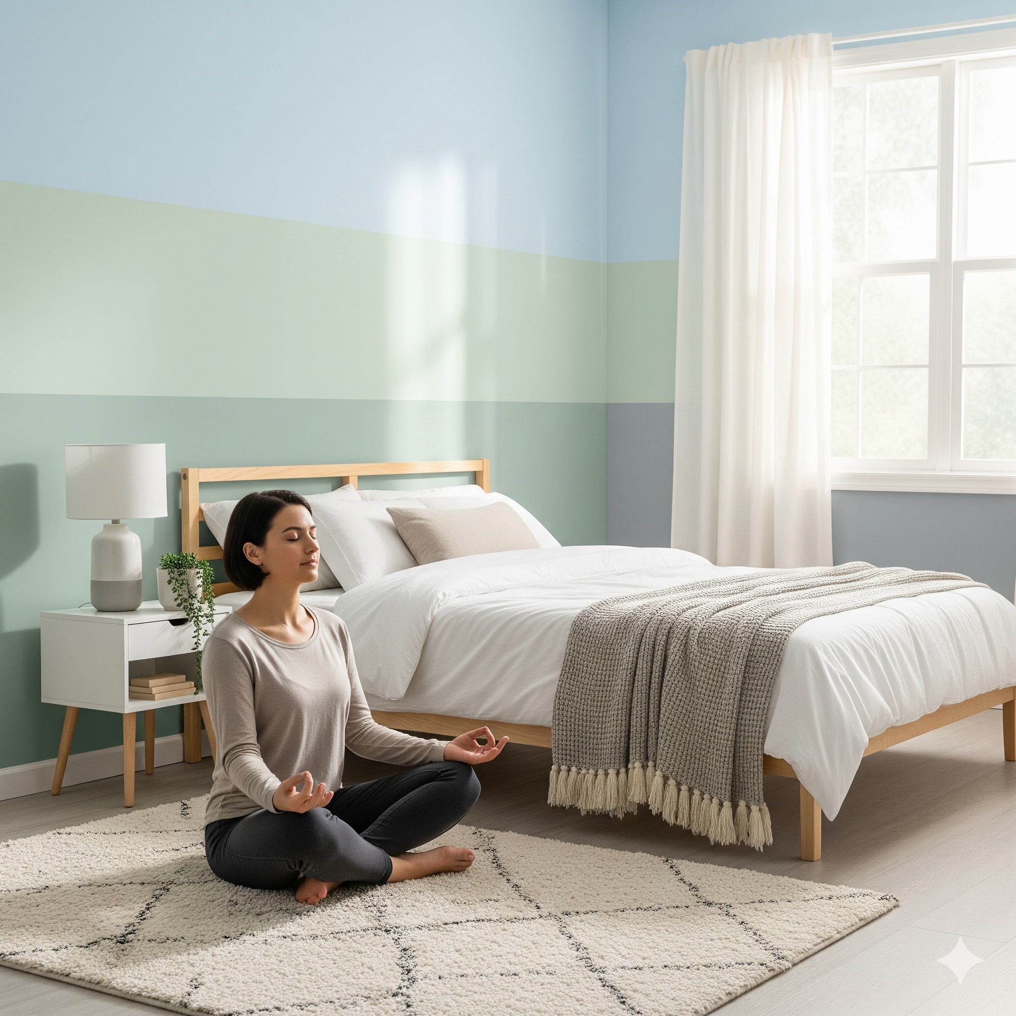
Calming greens, such as sage, pistachio, or eucalyptus, channel the peace of nature indoors. These muted earthy tones are proven to improve sleep quality and foster a grounded, soothing atmosphere—perfect when aiming to balance tranquility with style.
Delicate blues and blue greens, like pale sky blue or spa-like teals, evoke calm and emotional balance. With their soft, airy appeal, these shades lighten spaces and encourage restful energy.
For those seeking gentle pops of color, lavenders and blush pinks bring a dreamy, comforting vibe. Pastel lilacs or dusty pinks inject warmth and personality without overwhelming the senses.
On the other end of the spectrum, deep tones like charcoal, rich browns, or muted navy can cocoon a room in quiet luxury. These shades feel dramatic yet soothing when balanced with light textiles and soft lighting. Ultimately, the best relaxing paint color depends on your personal preferences, room lighting, and style goals. Testing color samples under different lighting conditions is key—what feels calm in the morning may change under artificial light. Layering soft furnishings, lighting, and textures will further amplify the tranquil mood of your painted space.